


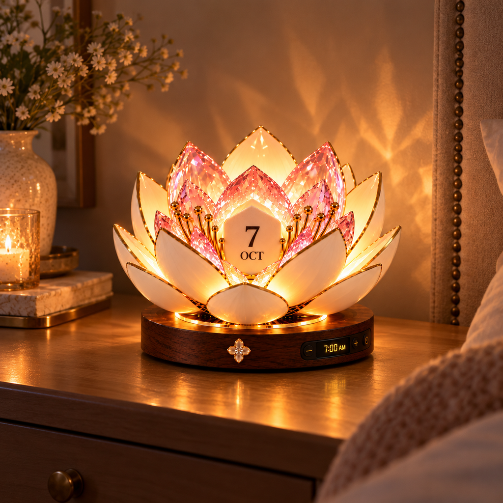
The lotus petals and warm light are the first things I notice on my nightstand at sunrise. The date display is easy to spot without making the piece feel like office equipment.
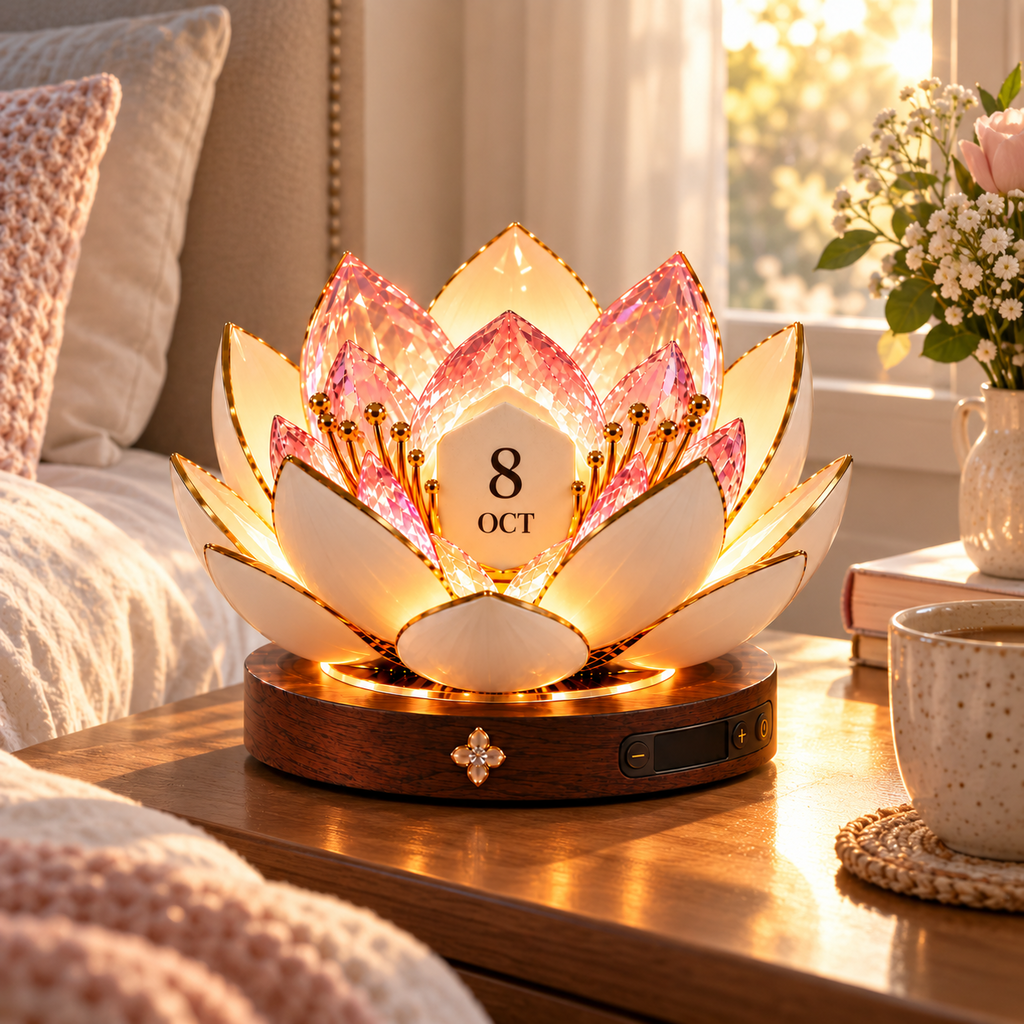
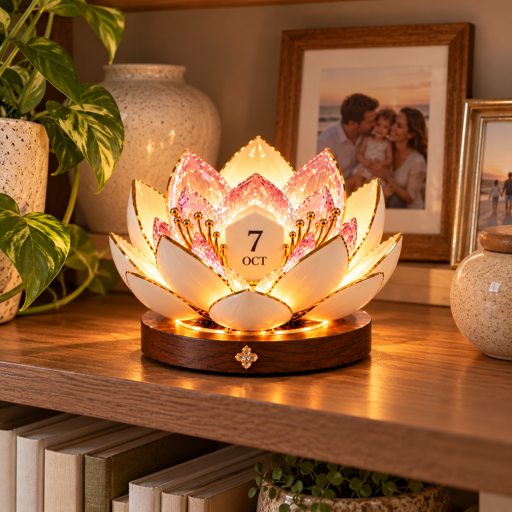
I placed it beside two books and a small plant, and it immediately became the focal point of the table. The faceted petals catch the light beautifully in the evening.
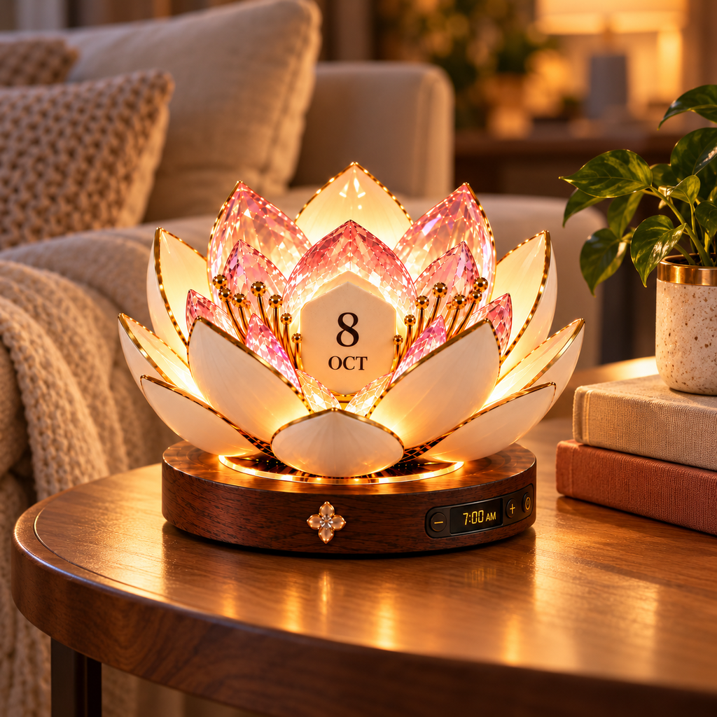
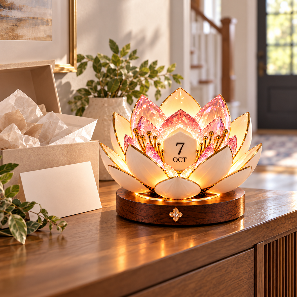
The wood-look base fits our console table and the open flower adds just enough glow near the front door. It feels decorative even when I am not checking the date.
The calendar sits beside my laptop and adds a warm, calm detail to the workday. I like having the date in view without another bright computer screen.
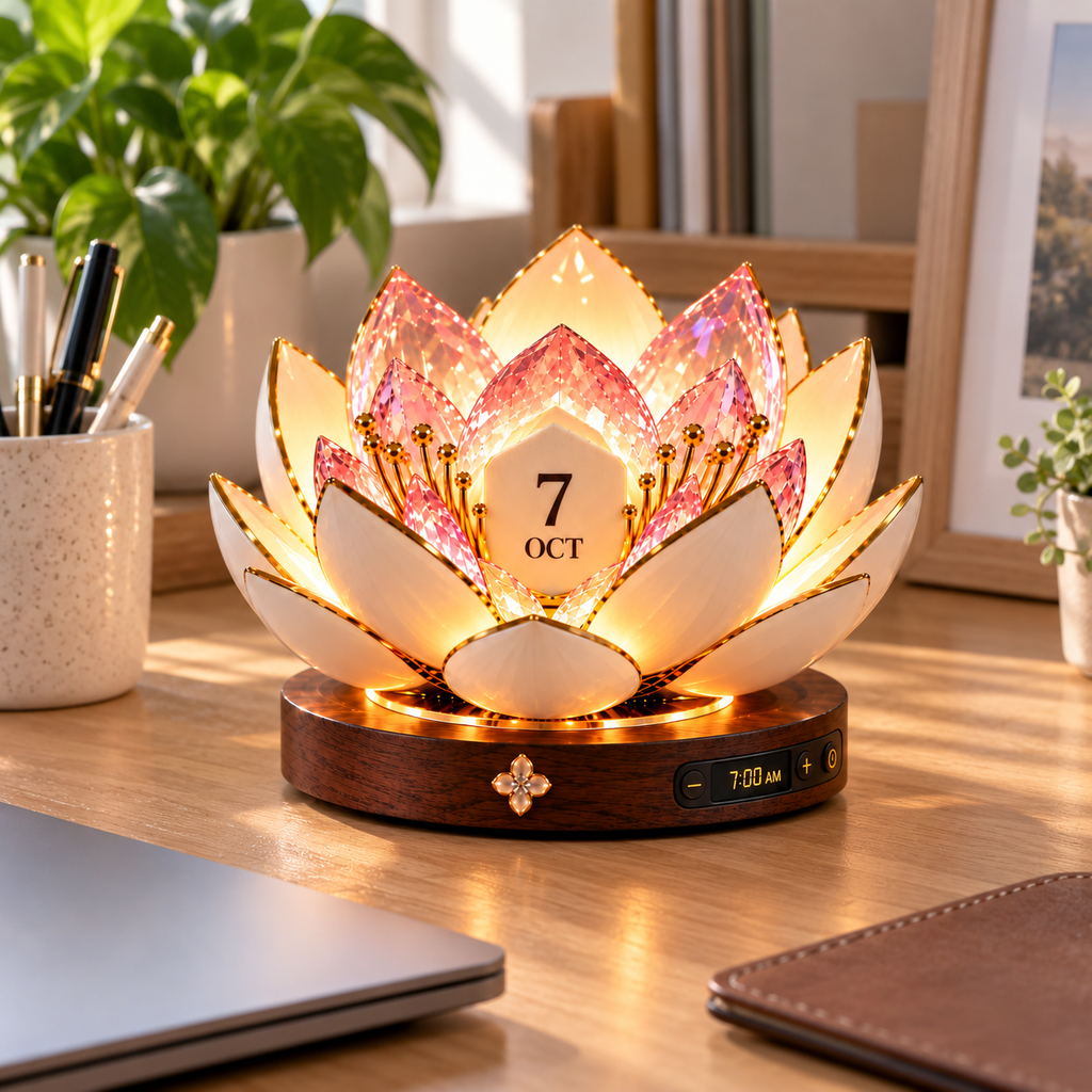
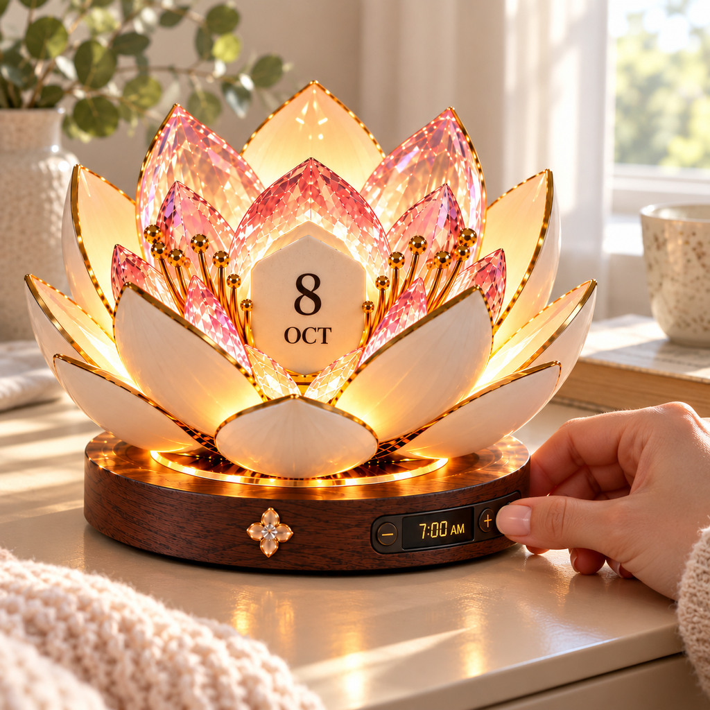
Up close, the mix of pink crystal-like petals, cream outer layers, gold trim, and small stamens gives the flower real depth. It looks different as the room light changes.
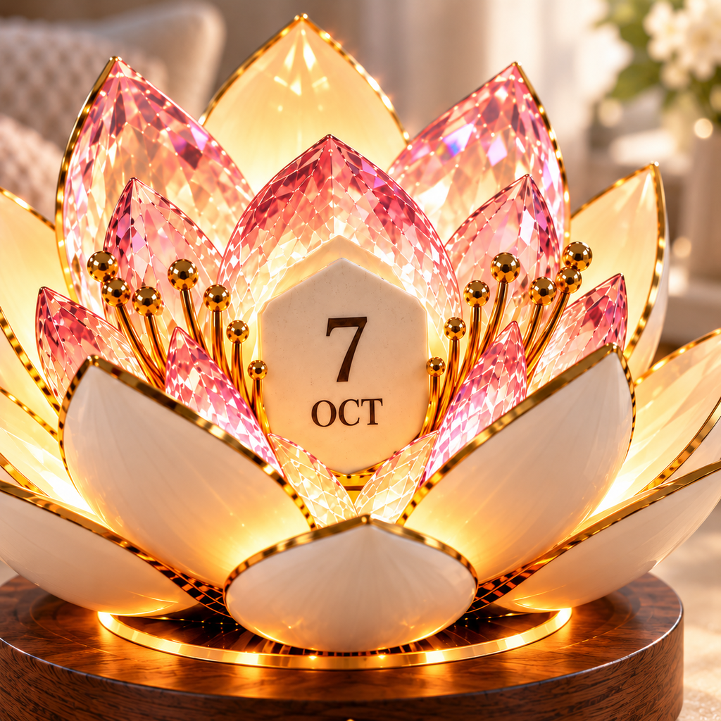
The warm glow reflects softly on the wall behind my dresser. It is decorative rather than harsh, which makes the blooming shape especially pretty after dark.
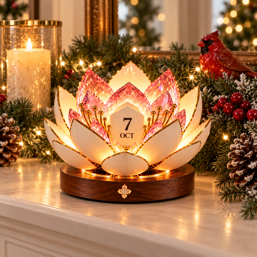
The Christmas Cardinal version works beautifully with our evergreen garland. It gives the mantel a seasonal focal point while still keeping the date display useful.
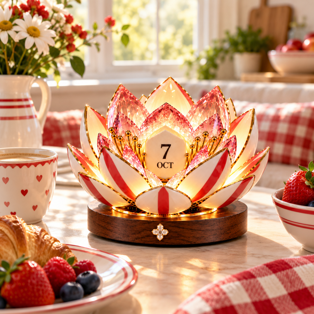
The red-and-white style is playful without looking like a toy. Morning sunlight through the petals makes the whole breakfast corner feel cheerful.
The deep blue petals and gold accents look sophisticated on my office shelf. The warm inner light keeps the darker color from feeling heavy.
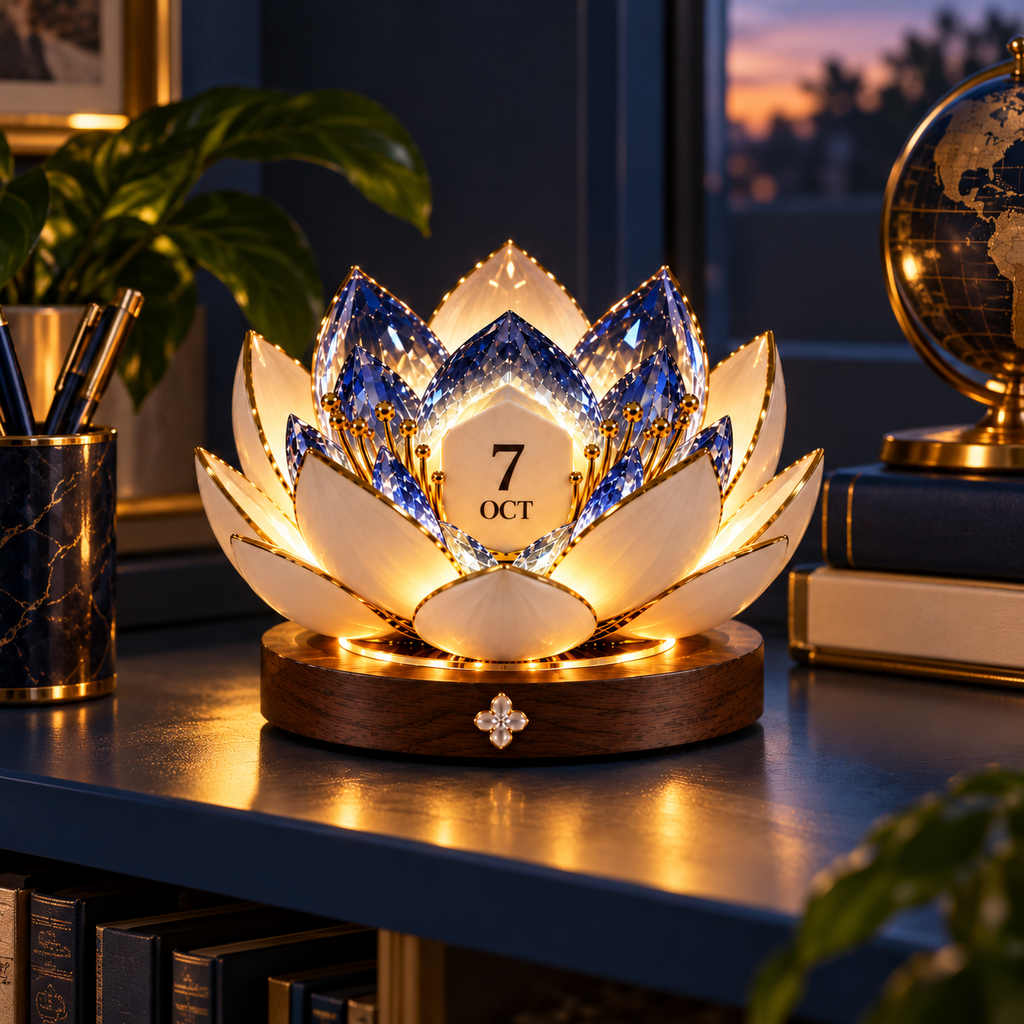
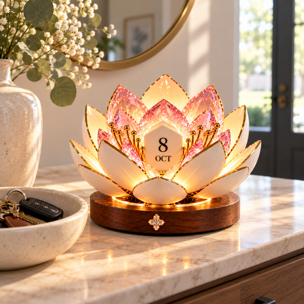
I wanted something useful that did not feel generic. The recipient opened the flower display right away and found a perfect spot for it on the entryway cabinet.
I spent a minute learning the buttons on the base, then changing the displayed date became straightforward. The controls are tucked low enough that they do not distract from the flower.
The lotus calendar adds a soft glow to our bookcase without hiding the frames around it. It feels like decor first, with the date function neatly centered.
I like having a calendar piece that is meant to stay out instead of being replaced every year. Updating it has become a small part of my morning routine.
The layered petals have enough depth that the display still looks finished from the side. That matters on our open console, where people see it from the hallway and living room.
One glowing piece replaced a small lamp and a separate desk calendar on my side table. The round base keeps the footprint tidy and the flower provides the visual interest.
The blooming flower theme felt more personal than an ordinary clock or calendar. It has a gentle, celebratory look that suits a bedroom or living area.
I was worried the petals might feel too ornate, but the darker round base grounds the design. It blends surprisingly well with our traditional furniture.
The centered date tile is clear at a glance, while the illuminated petals draw attention without flashing or looking busy. It has become the piece guests ask about.
The bloom is gorgeous, but the open petals take more horizontal space than the base suggests. I moved it away from a tall vase so the flower could open without feeling crowded.
It still looks attractive during the day, though the warm glow is much more dramatic at dusk or at night. I also needed a few tries to remember which base control changed the setting.